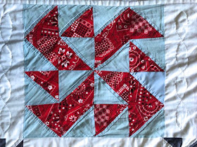
This is another quilt my friend found in Kampsville, IL, made in the 1960s or so. She had gifted it to the current owner.
Finding fabrics that blended in comfortably was a bit of a challenge here, so I thought I'd show some of the decision process I went through.
The solid blue needed the most patches. I had a blue in my stash, on the left, that looked great, but there wasn't enough for the 20+ triangles that were needed. I bought a new blue, on the right, slightly to the purpler side. Once it was in the quilt, I think it worked pretty well.
I also needed a 1/4" lavender gingham. I buy ginghams at estate sales whenever I see them, but haven't found much in the purples. The closest thing I had on hand was a darker purple plaid. Had I ended up needing to use it, I would have used the reverse (tiny swatch on the right) to soften the colors some.
Instead, I opted for a new gingham, even though it is a blend and not 100% cotton as are most of the original fabrics in the quilt. I decided it was still preferable to the reverse of the purple plaid. I did try a quick dip in some tea, but found that even a super quick dip made the white too brown and also, surprisingly, faded out the lavender. Here are all three swatches, from left to right - tea dipped gingham, original gingham, reverse of purple plaid.
The real trickster was the stripe. I had a navy on light blue pinstripe shirt in my stash, little swatch at the upper left in the photo. I also had a striped remnant in somewhat the same colors that didn't look too bad, at the lower right.
The issue with that stripe was that I would've had to piece several pieces together to use only the narrowly striped section of the print. I wasn't sure that I could make that look very good.
So, I bought this red white and blue stripe, even though it looked much too bright. It had a wider section of tiny stripes and the colors were at least kind of the same, and I was at the point of trying absolutely everything.
I tried tea dye on this, too, and got the same results as the gingham. It turned to brown too quickly. Tea dipped fabrics are the lower ones of both pairs. I could therefore relax into using it at is. It grew on me. I started thinking it looked surprisingly good.
Then I spent a lot of time of looking at my two top picks. I looked at them in lamplight and during the daylight. I looked close up and I looked from far away. I asked everyone who came into the house to vote. It was when my husband noted that the pin stripe shirt, on the right, ended up looked mostly like a solid blue from a distance and therefore really stood out that I really warmed up to the new striped fabric.
Also, these photos are of a block with a red background. When I put those two sample triangles on the block with a bright yellow background, the new stripe obviously won. The bright yellow really emphasized the "only blue" aspect of the shirt.


No comments:
Post a Comment