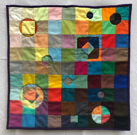
This is a challenge project from the Just Wanna Quilt Facebook group. We each got 2 packets of swatches from Free Spirit Fabrics, and the instructions were “make whatever you want”. I looked at these luscious colors, and decided I need some of that brightness and beauty in these hard times.
Casting around for ideas, I remembered a set of three little pieces I'd made back in the '80s that I'd also made with 2" multicolored squares.
These were a color theory experiment. All have the same base with varied ideas for coloring the circle shapes. #1 is bright, pure hues contrasting with the less intense squares. #2 is low contrast, circle colors in similar intensity and value to squares. #3 uses the very same fabrics for the circles as the squares, with top/bottom and right/left colors swapped.I made identical little (18") quilt tops out of the two sets of swatches. I used the colors in a gradation of value with mixed hues, similar to my inspiration pieces. I had to add 7 of my own fabrics to make the quilt tops square.
The colors actually glow. As I came downstairs on a dark, rainy morning, I noticed that even in the gloomy room, the quilt top on my work table was still glowing. How cool is that!
From who knows where, I came up with the concept of rotating one of the tops 90 degrees, stacking them one on top of the other, and then using reverse appliqué to let the colors of the second layer appear through the first. (Long story, made very short….) At some point, I realized that it’s a social change statement - an even ordering of light to dark, opening up to show the underneath and mix the layers together. You can read more about that in Part 1.
And then, I created a huge technical challenge for myself. (I do this fairly often...)
I decided that a simple reverse appliqué wouldn't necessarily look like there was another layer underneath. I needed some depth. Ideas I thought of and sometimes even mocked up were:
1. Put a piece of matt board between the tops (would look too stiff)
2. Tuck some thickish perle cotton inside the turn under (made just a ridged edge, still not layered looking)
3. Put a layer of flannel between the two tops (didn't show much)
4. Put three layers of flannel between the two layers (that's what I ended up doing)
In order for that to work, I needed to have a much deeper seam allowance to both cover the thicker edge to the hole and still have enough fabric to tuck under. Easier said than done I discovered!
Here's the technique I came up with.
Baste around tracing paper shapes.
Cut
top pieced layer and all three flannel layers inside basting line,
leaving 1/2" or more turn under allowance. Be very careful to not cut
the back layer.
Clip curves almost to basting.
Trim off just the flannel layers to the basting line. Be super careful to not cut either pieced layer.
Turn cotton around and under the flannel layers. Check shape against the tracing paper pattern.
Baste around again. Stitch underneath the turn under by holding the edge up and away a little bit.
Joyfully remove basting and move on to the next shape.
Finish some shapes and cut swatches to plan out the next.
All in all, it did work, but boy, was it hard to keep the geometric holes really true, and I got more puckers than I'd anticipated, and I hadn't considered that there wouldn't be any turn under at all at the inside corner of square cut outs. I finally just forged ahead and did the best that I could.
This
hole is an homage to the inspirational little projects from the '80's.
It was tricky! For the other two holes with shapes inside, I used the
fabric removed from the hole. For this one, there wasn't enough fabric
to give me that large turn under allowance I needed. So I had to cut a
new yellow square.
And I do, indeed, love the result. The colors are so gorgeous! And the meaning I've given it is so true to my heart.


No comments:
Post a Comment