

Here's how the owner came to acquire it:
I don’t collect quilts or even know how to use a sewing machine. I just really liked the quilt colors and patterns.....when I saw it in an antique mall in Columbia, MO (I honestly love Orange as a color). So much so, that after leaving without it I regretted it. The following Monday I was back at work and just called them on a whim and made them an offer and they agreed to ship it to me.
Well, what a fun story! I love that the quilt kept calling to him from half way across the country and waited for him to call the dealer!
The owner sent me some photos and I gave him a general assessment. Then he said:
I am astonished that it would be from the 1870s. I figured it was sewed in the 1960s or 70s because of the paisley pattern on the inside. But when I looked at it closer, it did seem to be hand sewn because the stitching was very uneven. I think I would like to proceed to get on your waiting list to fix this quilt. I would like for my new family (my daughter just turned 9 months old!) to be able to use this quilt going forward.
We had plenty of history to talk about. And plenty of decisions to make about how to treat the quilt. First of all, though paisley was indeed very popular in the 1960s and 70s, it's an ancient design, going even further back than the 19th century when this quilt was made. An exhibit at the International Quilt Museum in Lincoln, NE, called "Old World Quilts" shows pieces documenting paisley designs on palampores from India that made their way into European markets in the 1700s. (An amazing exhibit, well-worth visiting online.)
Another topic is the dye technologies that created the wonderful color combinations on this quilt.
The orange is called chrome orange. It's known popularly today as cheddar, but that is a modern nickname for it. The color was developed in the 1820s, among the first mineral-based dyestuffs, as opposed to the earlier plant-based dyes. It became really popular in the 1840s and onward. In and of itself, it can't be used to give a precise date for the quilt.
The pink is also an important color of this era. The prints were called double pinks because they were made with several shades of the same dye. Double pinks were also popular for many, many decades. Earlier on, they tend to be softer pinks that become deeper and brighter in the later 1800s. The modern nickname for them is raspberry pink.

The teal blue of the binding and some of the star points is also a color seen often in this era.


Here's an area of the quilt where the paisley fabric is still in good shape. Isn't it gorgeous?

My friend Martha Spark told me that the brown dyes responsible for this kind of damage came earlier in the 19th century, and the black dyes were to blame in the later 19th century. In fact, there really weren’t any viable black dyes earlier on in the century. So she dated this a couple of decades earlier in the 19th century than I had originally thought. Thanks, Martha! Martha is an encyclopedia of fiber knowledge.
This is a process that cannot be fully stopped because the damage is being caused by the dye that was absorbed during the manufacture of the fabric. So, I had to recommend against using the quilt, as the owner had hoped to do. But I also told him that it’s definitely a beauty and would delight many quilt collectors, so he decided it was totally worth trying to preserve it as best as possible. I wholeheartedly agree!
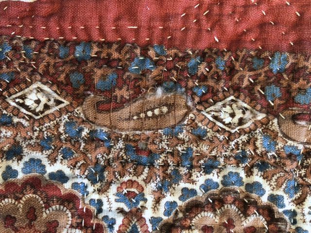
Here are some photos of the popping damage.
1. One of the design elements that is intact. Note the dark brown scallops on the edge of this oval.

2. Another of the same design element where the dark brown dye is eating away the fabric and batting is starting to show.

3. And another spot, where that dark brown dye has eaten the whole border and the center of the oval is being held on by the quilting stitches only.

4. Here, you can see the same process happening on the small paisleys and diamonds.

5. This area is one of the worst. There are a few of these long, thin areas of severe damage, so I’m guessing that the quilt was folded for a long time and that exacerbated the disintegration process.

Next topic - deciding how to protect the damaged areas.
One option was to stitch across the open places to help hold the batting and design elements in place. It would be important to put stitches into just the white and blue and tan areas to avoid stressing the dark brown any further. Another option was to cover the entire back with a new cotton, and another was to cover the entire back with a sheer. And lastly, this one invented by Martha, was to cover the back with a new cotton, but make a "window" of a sheer fabric so the original would still be known.
In the end, the owner and I agreed on combining two of the options: I used the couching stitch to secure fabric bits and batting to the quilt. And it the worst areas, where there was no longer enough fabric to couch into, I applied a tan polyester netting. In this way, as much of the original backing as possible is totally visible. I'm really happy with this solution, because for both myself and the owner, that backing fabric, and the interaction of that fabric with the brilliant front, is a big part of the appeal of the quilt.
Here are two photos of the couching stitches holding down raw edges of the designs.


Here's the whole back, after all the stitching was finished. You can see that the netting has lightened the look of the fabric a bit, but I think it's not too distracting.

And finally, I did a bit of stitching along the worn binding, using a herringbone stitch back and forth across the edge.

I absolutely enjoyed the fabrics and design of this quilt, and could still be staring and smiling at it if I hadn't have had the responsibility of sending it back to its owner!
this is a delightful quilt full of interesting textile history and I'm glad it was rescued and repair was sought by its owner. "that" orange! (and the wonderful paisley) WOW!
ReplyDeleteYou are soooo right to be in love with this one! It's amazing!
Delete