Do you know how there can be a project with one little glitch that ends up defining the whole process even though the project was otherwise super successful and fun? Well, this quilt had one pesky fabric that would not "accept" anything in my stash as a fair patch.
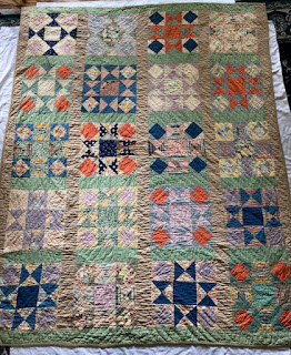
You see, it's actually a really fun quilt. I date it to the 1940s or so. I'm super fond of the color combination, especially the use of the solid orange. I'm generally not a fan of orange, but in this case, I absolutely love the bright sparkle it gives to this happy quilt!
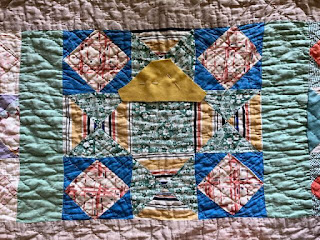
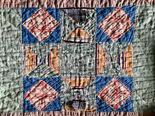
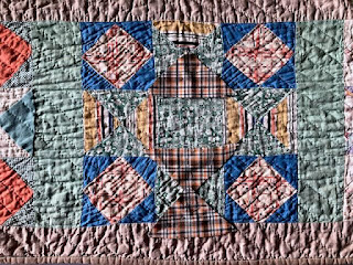
I discovered that the pattern (Brackman #1641) was published as Combination Star in the 1890s, and as Ornate Star in the early 1930s. It's built like a Variable or Ohio Star with the addition of squares on point in the corners.
Here's a photo of the owner's mother, Viola, and father, taken in 1972. Viola made this wonderful quilt. It is now going to be gifted to her grandson.
Well, actually, there were several fabrics that were tricky to work with.
- Red on white print.
You'd think it would be a simple ask....but no. I had two vintage, tiny red plaids. The fronts were too bright. The reverse of one, at the lower left, looked like a solid tan. The reverse of the other, at the upper right, is what I chose. I also had a couple of vintage red and white print triangles, exactly the right size, but only two of them. I don't like tea dyeing, as it is too acidic, but have been meaning to try actual dyeing sometime, and might have done so for this, had there been enough triangles.
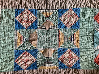
- Very degraded and broken white dot on what used to be green (with previous mending).
The first choice I needed to make was whether to find a patch to match the current degraded color or to match what the original color might have been. Since I would be leaving a fair number of triangles as is, I thought it'd be best to go for a faded green, kind of a middling choice.
I had nothing on hand, even the greyed green prints that I had on hand were totally wrong. I purchased a white dot on green that looked like a perfect dull, olive-y green online, but was nowhere close in actuality (too bright on the right side, too pale on the reverse). I ended up using a vintage solid that was pretty close to the sashing green, as the least visually distracting. Also, it went well with another white on green dot elsewhere on the quilt.
- Green stripe.
Again, I had nothing on hand. What I used was a plaid, that I discovered would read as a stripe if I cut it in the right orientation, with the darker plaid lines running horizontally.
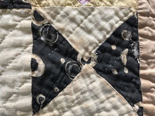
- Large white dot on indigo. Or is it black?
The damage in this fabric provides a little bit of evidence of fabric technology history. The white design was made with either a
resist, which kept the indigo from being absorbed in the print places when the fabric was dyed,
or a discharge, which took out color from a solid indigo to make the white design. Whichever process it was, the substance applied weakened
the fabric. That's why the damage is only in those white areas.
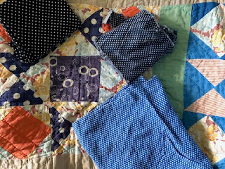
I'd run low on white on indigo dots, so had little to choose from. None were close to what I needed.
A student of mine (I was doing a show-and-tell about the trials and tribulations of fabric searching) found this great replacement online for me! I needed it in two places. In this place it worked great!
But I had totally not noticed that in the second place it appeared in the quilt was was actually a black! Perhaps in the first block, the fabric had faded towards blue due to getting more light. It was in the center of the quilt, while the block below was in a corner.
Anyhow, I decided to use the same blue fabric. Since all but one of the triangles in this star needed to be patched, I just went ahead and patched them all.
- And finally, that stripe. What a bug-a-boo (vintage terminology used for a vintage quilt)! I had no stripe or plaid that was even close in colors. I came up with the thought to find a solid manilla-ish color to echo the widest stripe in the print.
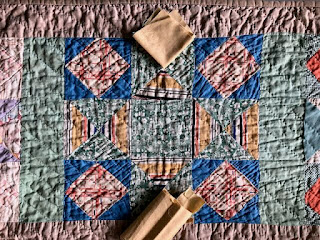
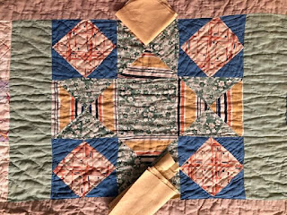
I generally check colors in both daylight and lamplight and try to find a color that looks passable in both. The fabrics I had all looked good in one light and horrendous in the other. Nothing in the middle, i.e. passable in both lights.
I photographed the test swatches in both lights, and discovered it's really not possible, or at least not in my skill set, to get the pixels and my eyes to see it the same way. Here's the closest I could come - daylight first photo, lamplight second.
And then....I tried every single idea I had.
I tried to find a tan that would be neutral. But they all had the same result, good in one light and horrendous in the other. Nothing in the middle. Plus the swatches pretty much blended in to the surrounding green too much.
I thought about black as another neutral, but my blacks didn't blend with the quilt because, well, I'd just covered up the only other black fabric that there was. Greys were really wrong for a quilt of this age.
I went back to my stash one more desperate time, and pulled brown plaids. The quilt had no actual brown so these were way out of place. But lo and behold, I found a fabric that actually works, even though it has a bit of brown! It's that wonderful orange makes it sing with the rest of the quilt!
Phew! Let me tell you, what a saga! I admit it, I can get very fussy with fabric choice, but in the end, I think it makes all the difference to a successful repair.
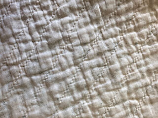
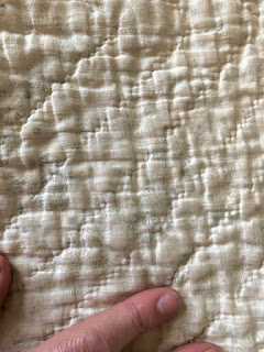
At first, I thought the back of the quilt was a solid white or muslin. But taking a closer look, I realized it was a very delicate and/or faded print.
Even after all of this, I still really love this quilt. And now, I have many additions to my mental list of fabrics to keep an eye out for when I find vintage or reproductions.
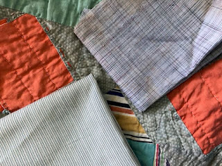
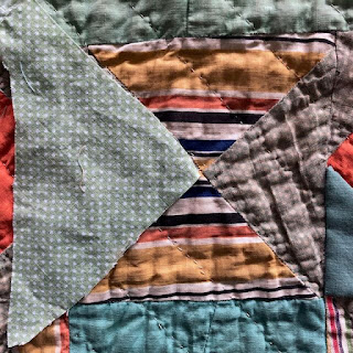
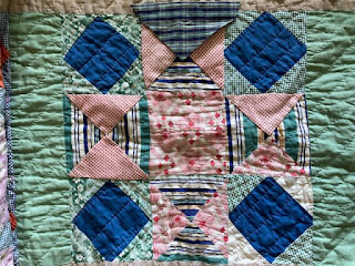
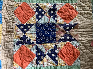
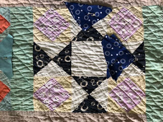
And finally, here are some blocks to highlight this super fun fabric collection. You can click to enlarge them and get a better look. The block on the right in the last photo is my favorite - purple and green, love that combo!








I love reading your posts and learning how you evaluate and navigate choosing fabrics for repairs in old quilts. Well done on this one. It's a great quilt!
ReplyDeleteHi, Nancy! Thanks for the kind words. I'm always glad to hear from someone who is learning from what I write. Quilts are indeed wonderful.
DeleteGreat save, and I loved reading your thought process.. Old fabrics are my fav.
ReplyDeleteThanks for the kind words, Linda. Yes, old fabrics are so fun, and on top of that, contain so much info on history of technology and societies and trade.
DeleteGreat job choosing patch fabrics that "disappear" and preserve the original quilter's palette for the quilt.
ReplyDeleteThanks much, Rebecca. I heard, unfortunately did not note who said it, that one test of a good patch is that people can look at the quilt without out pointing and saying "There's a patch!" I do try to do better than that and keep to print style and such, but sometimes even just blending in is a challenge. The funny thing is that it's not terribly old, so I thought finding things would be a breeze.
Delete